Branding voor
oxyo
StudioPlay® guided OXYO and founder Sarina in developing a powerful visual identity and brand that combines yoga, nutrition and kickboxing in Ibiza.

Strategic focus for results that matter
Brand Strategy • Creative Sessions • Moodboards • Name Creation • Logo & Corporate Identity Development • Visual Coaching
Collaboration and Approach
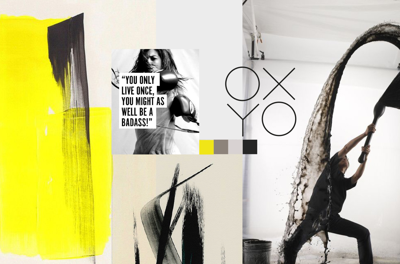
Sarina was looking for a creative partner to translate the essence of OXYO into a brand identity. In sessions with Tim, core values were discovered and mood boards were created that gave direction to the name, logo and corporate identity. Where Sarina used to lean towards a soft, feminine style, visual options inspired her to embrace a more assertive, more powerful style. The name OXYO derived from oxygen was chosen as a symbol of energy, breath and lifestyle.
Results and Impact
OXYO grew into more than a brand: it became the guide to Sarina's professional and personal development. The new visual identity exudes strength, clarity and purity, and supports its mission to bring yoga, nutrition and kickboxing together. Sarina highly recommends Tim and Studioplay® as creative partners because of their ability to capture the essence and translate it into a unique and inspiring brand identity.