Branding voor
De Verrijking
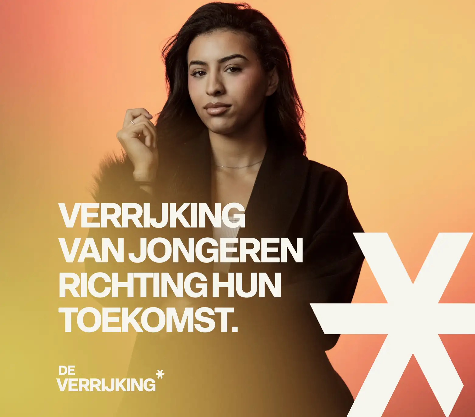
StudioPlay® developed a powerful visual identity for De Verrijking that centers on personal growth and the future of young people.


Strategic focus for results that matter
Brand Strategy & Positioning | Visual Identity & Logo Design | Color & Typography Concept | Art Direction & Photography | Graphic Design & Brand Assets
Collaboration and Approach
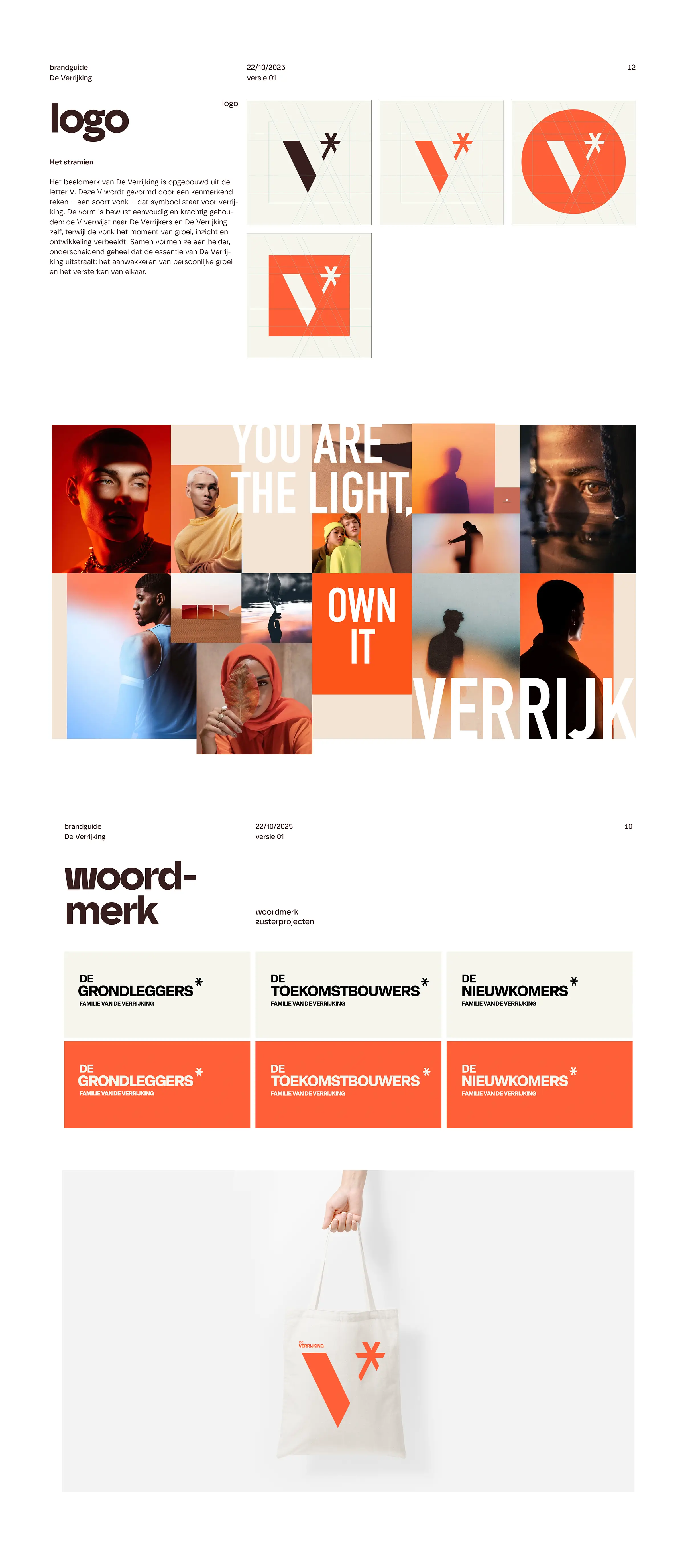
For De Verrijking, StudioPlay® developed a visual identity that puts young adults and their futures at the center. Based on the core values of growth, trust, and connection, a recognizable brand style was created. The logo, built around the letter V and a distinctive spark, forms the foundation of the identity, along with warm colors, typography, and character-driven photography.
Results and Impact
The project resulted in a powerful brand identity that is reflected across various communication materials, from banners and flyers to stationery and other applications. The distinct visual language gives young adults a platform of their own and connects various projects and partners under one recognizable identity. In this way, De Verrijking radiates growth, trust, and a sense of future perspective.