Branding voor
Dapo
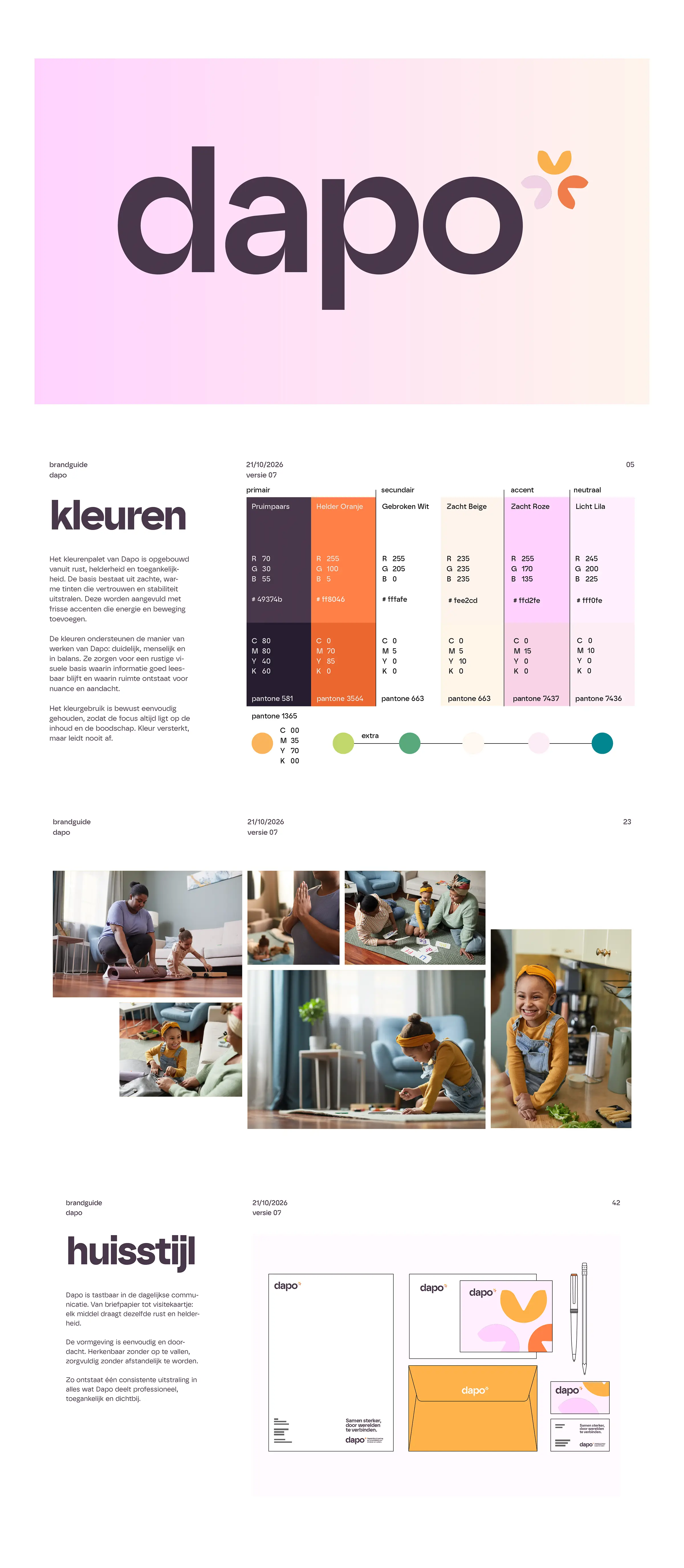
StudioPlay® developed a visual identity for Dapo in which color, shape, and typography come together to create a powerful and recognizable brand image.

Strategic focus for results that matter
Brand Identity & Logo Design | Wordmark & Icons | Color & Typography Concept | Brand Guide & Visual Guidelines | Web Design & Web Development
Collaboration and Approach
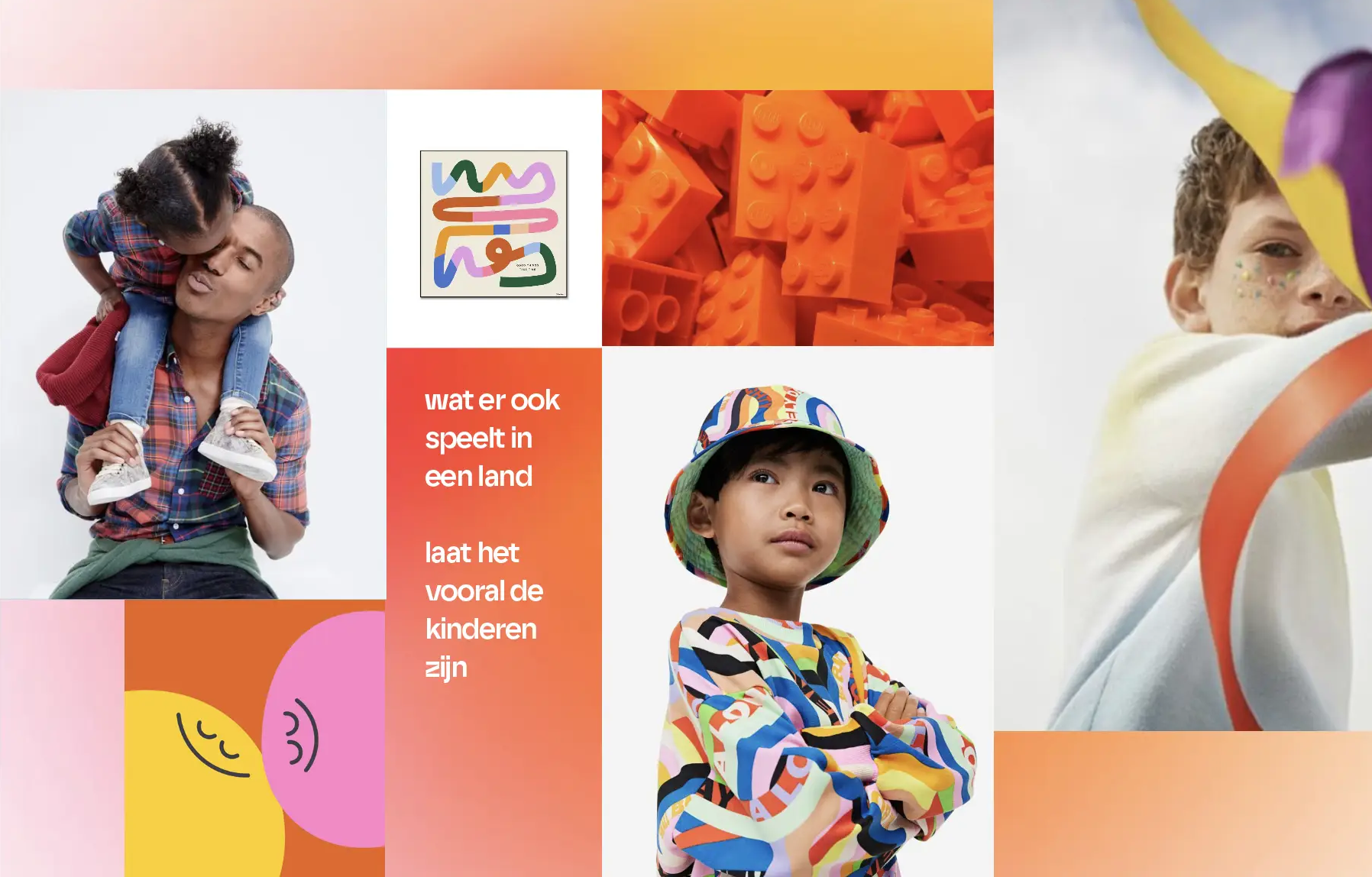
StudioPlay® developed a new brand identity for Dapo that reflects the warm and committed nature of the youth care organization. A creative direction was established based on various mood boards, with a focus on accessibility, recognizability, and trust. This foundation was further developed into a wordmark, custom icons, and a cohesive visual style.
Results and Impact
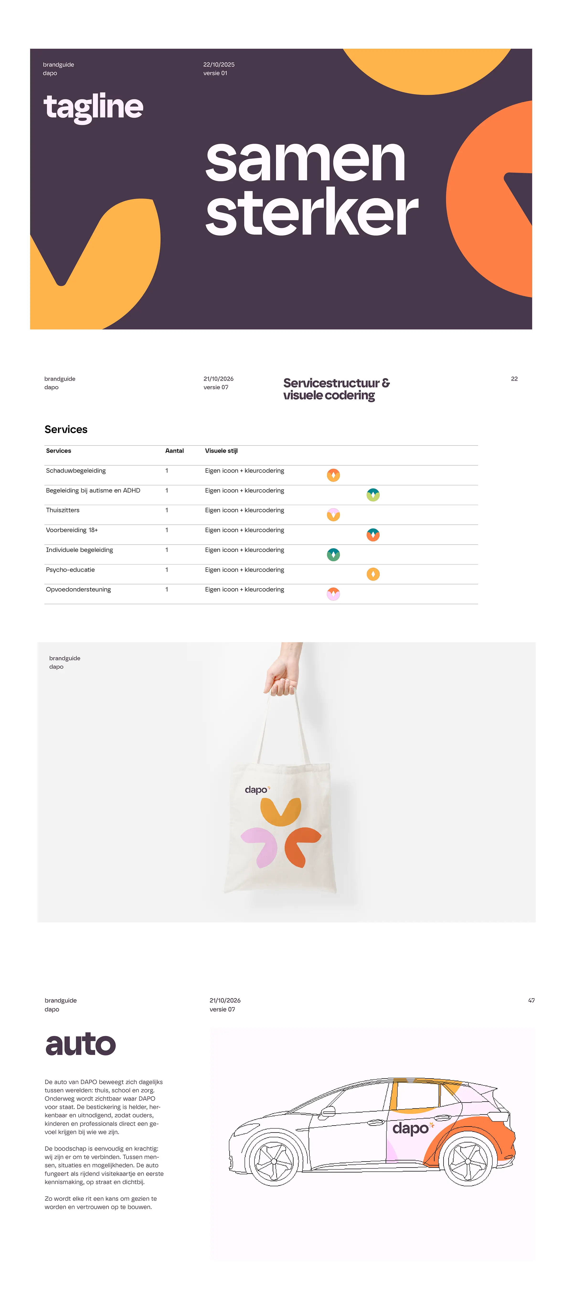
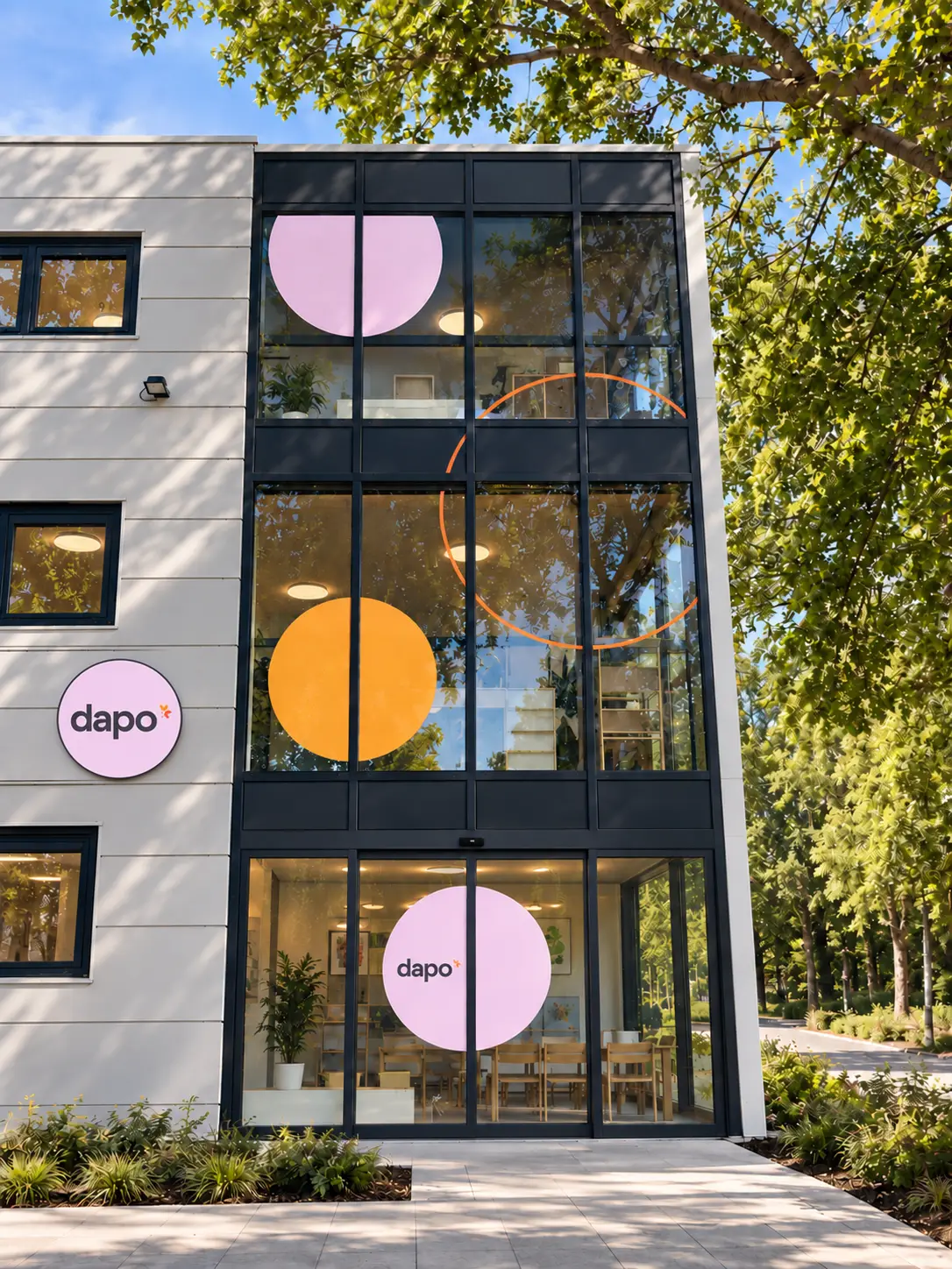
The project resulted in a recognizable corporate identity that comes to life in various ways. From a revamped website and custom icons to building signage, wayfinding, and apparel. The key guidelines have been documented in a brand guide, ensuring Dapo has a consistent brand identity that makes the organization recognizable at every location.